Making of Pigments of Picasso
At the beginning of the semester, Profesor Alberto Cairo gave us a prompt - generate a data visualization with Google Trends data. Google Trends allows for a user or journalist to obtain a search index for a set of terms over a period of time. This allows for the user (with some assumptions) to understand seasonal or abnormal spikes in interest.
I went into the semester wanting to do something about color. My use of google trends data was predicated on the assumption that people search for the color that they like the most i.e. search index for red is higher than green.
I generated a preliminary plot with Google Trends’s wonderful user-interface that gives the user well designed time-series data as a line plot and maps this data allow for the user to find geographical variations in search interest.
[
Take-away 1: Red and blue are the most popular colors hands down
Take-away 2: There are weird exceptions to this rule.
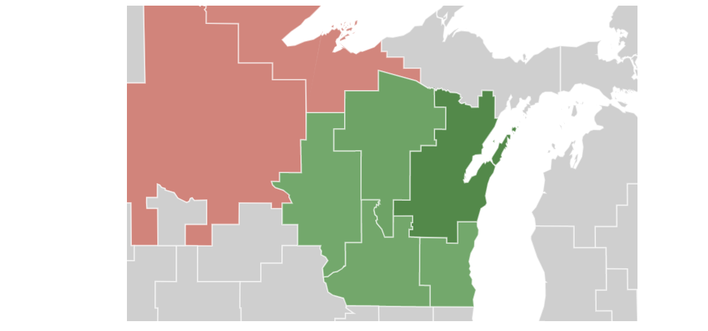
One of these exceptions was Ohio whose most popular color was ‘green.’ Google Trends allows you to interact with the map that it generated to zoom into those exceptions.

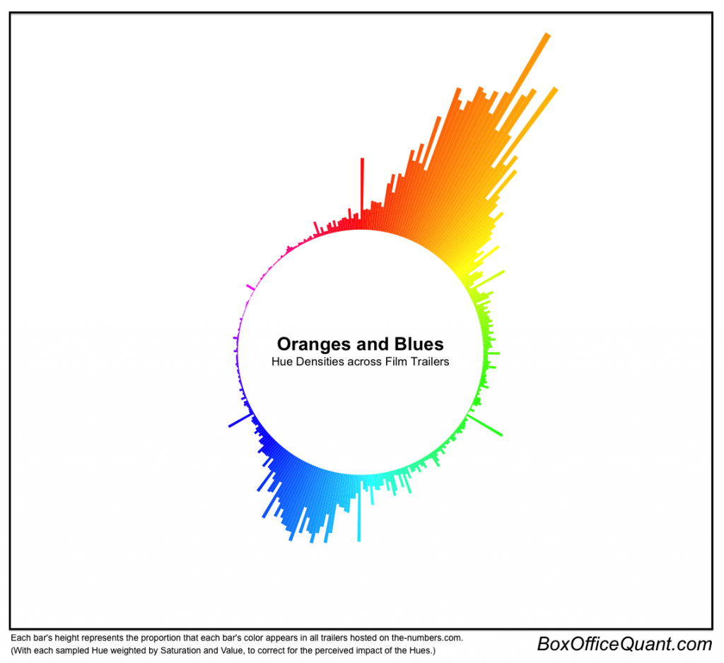
I was wondering if there was any particular reason why that region had a different “favorite” color. There is a location in that region of Ohio named “Green Bay.” That explains it. This negated one of the assumptions that I made earlier on when I was doing the analysis. The most searched for color term is may not be associated with people’s “favorite” color. However, blue was really up there in terms of what people searched. I then went on a tangent on what colors are used in paintings the most when I stumbled on a data visualization of the most popular colors in movie posters over time.
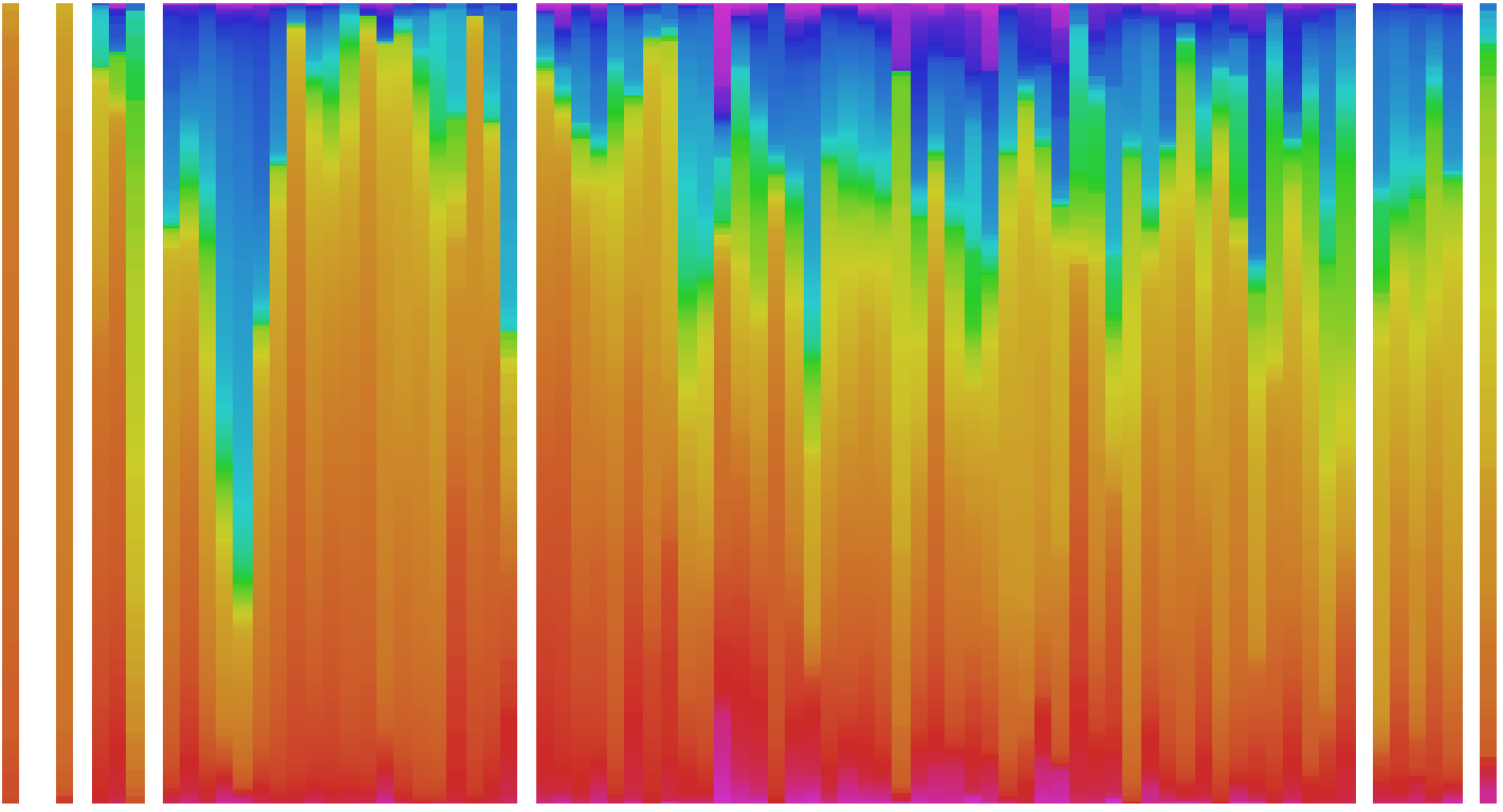
Vijay Pandurangan a software engineer was kind enough to publish his image analysis pipeline, so all I had to do was figure out an interesting sample to visualize and then the magic would happen. I had learned about Picasso’s Blue period and I wanted to see if I could use this pipeline to visualize the change in his color usage over time. While getting the data was not as hard as I imagined (thank you to people who name their images on websites in a meaningful way), I had some lofty ideas for how to present this data.

I wanted to then make an animation of all the different years so people can see the peak or bulge that happens on the blue end. However, Since Picasso’s Blue Period only lasts for a short period of time followed by the Rose Period which also only lasts for a short period of time, I decided that a static visualization might be the way to go.
Here is how I curated my data.
- I found a website with a listing of a wide sample of Picasso’s artwork.
- I used the “Download all Images” plug-in for firefox and iterated through all the pages on art-picasso.com
- I used a linux script to get all the files in the same directory.
- I used a Linux commmand to list all the names of the paintings and copied them over to an excel spreadsheet.
- I numbered and renamed the files because some of the files had names that were too large.
- I found pictures that were not paintings and I removed them from my sample.
The Linux script for collapsing a folder is below. This is the one time that I didn’t regret switching over to Apple at the beginning of the year.
find TargetDirectory/ -mindepth 2 -type f -exec mv -i '{}' TargetDirectory/ ';'
This is the Linux script listing all the names of the files in that folder and renaming them to a shorter format that I can use in the pipeline.
ls ~/TargetDirectory/
ls | cat -n | while read n f; do mv "$f" "file-$n.jpg";
I then fed the vector listing the directories for the files along with the years that the files were associated with into the image analysis program. This was all curated in Excel.


There were some anomalies in the data and it turned out that the color usage that is calculated is sensitive to the background of sketches (the lighting can determine what hue is present).
The final result was an SVG that was too big for my computer to handle. So I converted the file to a TIFF because that was the only way for the visualization to display properly without weird striations.
Then, I added the labeling for the x-axis as the year that the bar represents, made the design decision to flip the visualization to make it more scroll friendly. I decided to put the annotation layer in a hand written font to communicate that the categorization of the art periods is imperfect and scholar generated. Upon the suggestion of my peers, I decided that I would grey out all the regions that are not the “Blue Period” and talk about that time of Picasso’s life in the body of the article. I would repeat this for a couple more of the periods. I would then give a canonical example of a painting during that time to demonstrate the use of color.

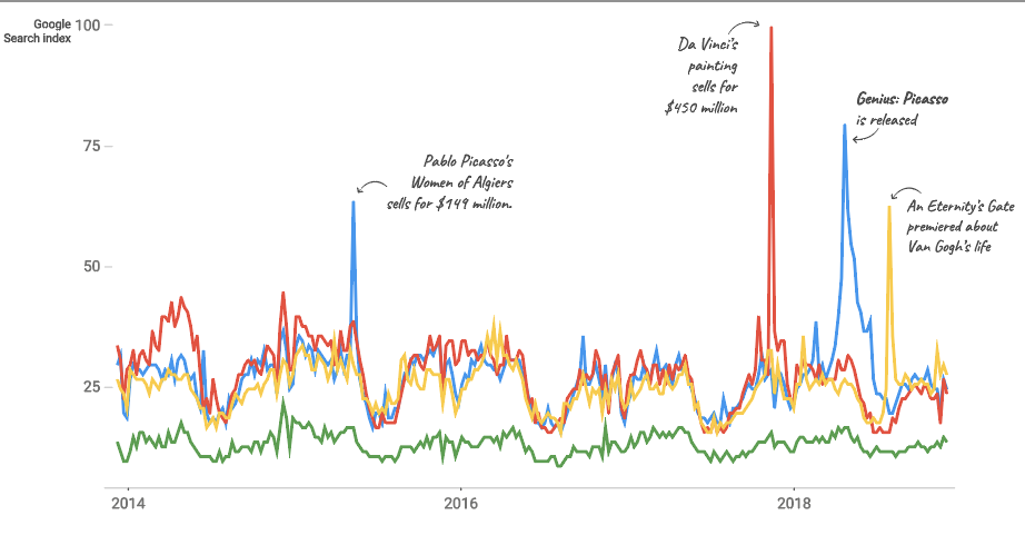
I then integrated the Google Search data of Picasso compared to other famous artists to show that Picasso is famous! I added an annotation layer explaining the various peaks in search interest over time to spare the reader the trouble of having to search the peaks on their own!

I would have to say that the hardest part about this project was to generate the website. With a small working knowledge of HTML/CSS/JS, I found myself struggling to actualize the layout of the project in a new language that I had no experience with. Additionally, it was a priority for me to have the project dynamic to the size of the project. Simple tasks like setting the background to be the size of the browser was immensely difficult because I didn’t understand the units of length that HTML uses.