Tufte Round 2: Visual Explanations
The Tufte books are a must read for anyone that is starting out in data visualization. I made my way through his book on representation of quantitative information and now I am reading his book titled “Visual Explanations.”
In reading the beginnings of his chapter on “Images and Quantities” I am reminded that data visualization has a history behind it. Tufte recognizes that images and quantities are everywhere but moving to the visualizations that we have today took large conceptual steps.
For example, although there were maps of regions for thousands of years, it was a big conceptual leap for maps to be viewed in terms of longitude and latitude rather than simply north, south, east, west. Moreover, I always assumed that the concept of Cartesian coordinates were introduced long BEFORE maps, but it seems that they were relatively close in development.
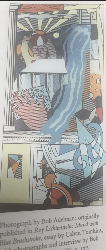
To teach the reader that when there are photographs of art published, the size of the artwork is often not conveyed, Tufte shows the below image.

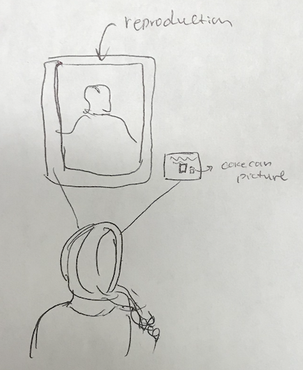
After showing the mural as a small figure on the page, he gives the scale of a room so the reader can understand that the mural is truly massive. This reminds me of all the people that go to the Louvre to see the Mona Lisa and they always are astonished at how small the painting is! While the design he proposes to solve this problem (a constant scaling factor for all the art that is reproduced within a gallery) is unpractical, I think that there needs to be a way to communicate size. This can be done with an infographic that compares the artwork to something iconic like a coke can!
Here is my proposition!

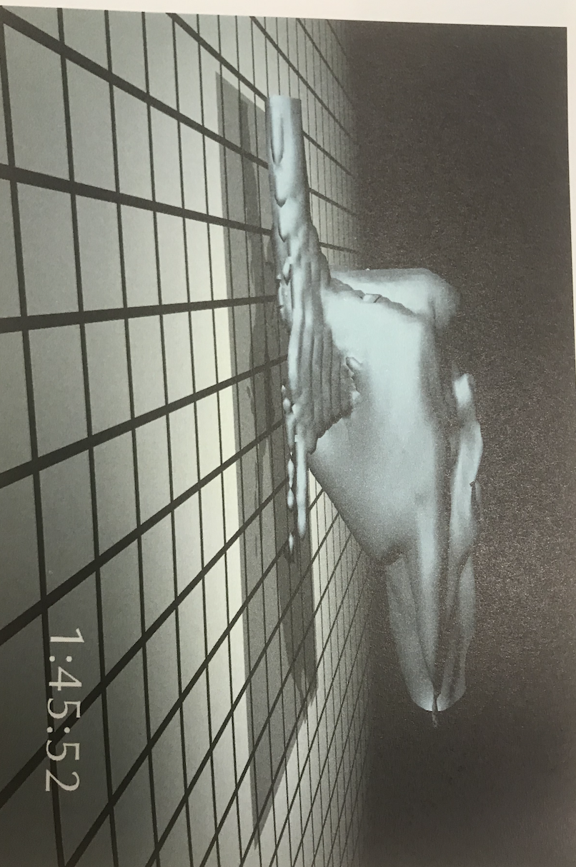
Tufte then goes on to redesign an animation of a cloud; however, I would make the argument that his redesign makes the reader have too much confidence in the simulation. The original version leads me to think that the simulation is inaccurate but one should focus on the change rather than the physical location, size and direction (all elements which are emphasized in the redesign).


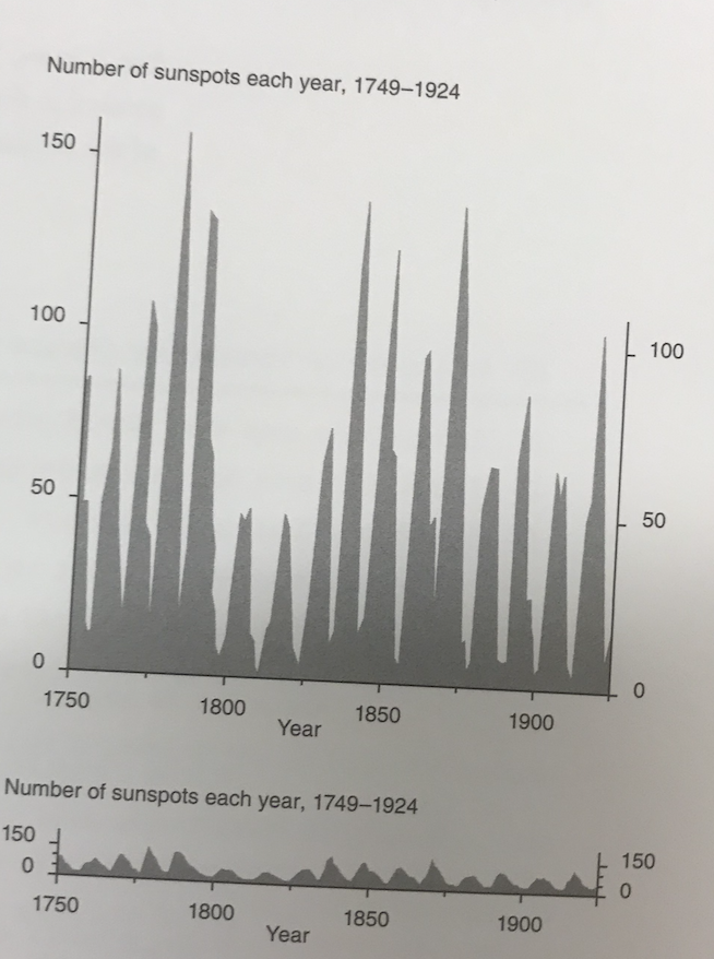
One last point that is made in the chapter that I really like is that rescaling an image can reveal new patterns. This image is of the number of sun-spots over different years. In the original plot, the large amplitude hides the underlying pattern of a quick rise in the number of sunspots followed by a more gradual decrease. Next time when I am plotting quantitative data in the lab, I will make sure to rescale to see if I see any new patterns!
