GIFs yay or nay?
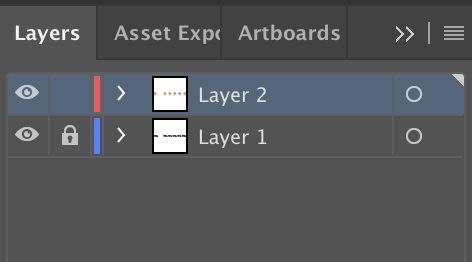
One of the students in my class presented their progress in their class and I wanted to do something similar. They made an animation of someone taking a bite out of an apple. These animations are very very visually appealing. So I wanted to learn how to make a ‘gif’ as well. Keep in mind that my knowledge of Adobe Illustrator is limited. Most of the posters that I design for conferences are made in Microsoft Powerpoint. After adding my background image to Layer 1 of illustrator, I locked that layer so and started tracing on another layer. I then started out with the Pen Tool with black and white. By playing around for an hour or so, I learned this rule.
Rule 1# If it doesn’t look good in black and white, it won’t look good in color.

While the below illustration doesn’t look good, for some reason (Ikea Effect), I decided to try and make it into a gif by changing the colors of the artist’s shirt. To do this, I fully illustrated my object and duplicated the artbord 6 times. I then changed the color of the shirt and saved each artbord as an SVG. It is important to duplicate the artboard to ensure that everything lines up when the software that you use to generate the gif stacks your images together. I used https://giphy.com/create/gifmaker to make my final gif. Interestingly, this is the name of the library that I downloaded to get gganimate to work earlier.

When I displayed it on the screen, no matter how much I increased the resolution of the GIF, the illustration was not looking crisp. Then I tried to see if I can use keyframes in CSS to animate the SVG. However, since my different objects were not in different layers when I drew the original illustration, each layer was grouped when I exported the file from illustrator. This makes it hard to define a class for the shirt object and manipulate the color of the shirt.