Animation? Encoding time series data
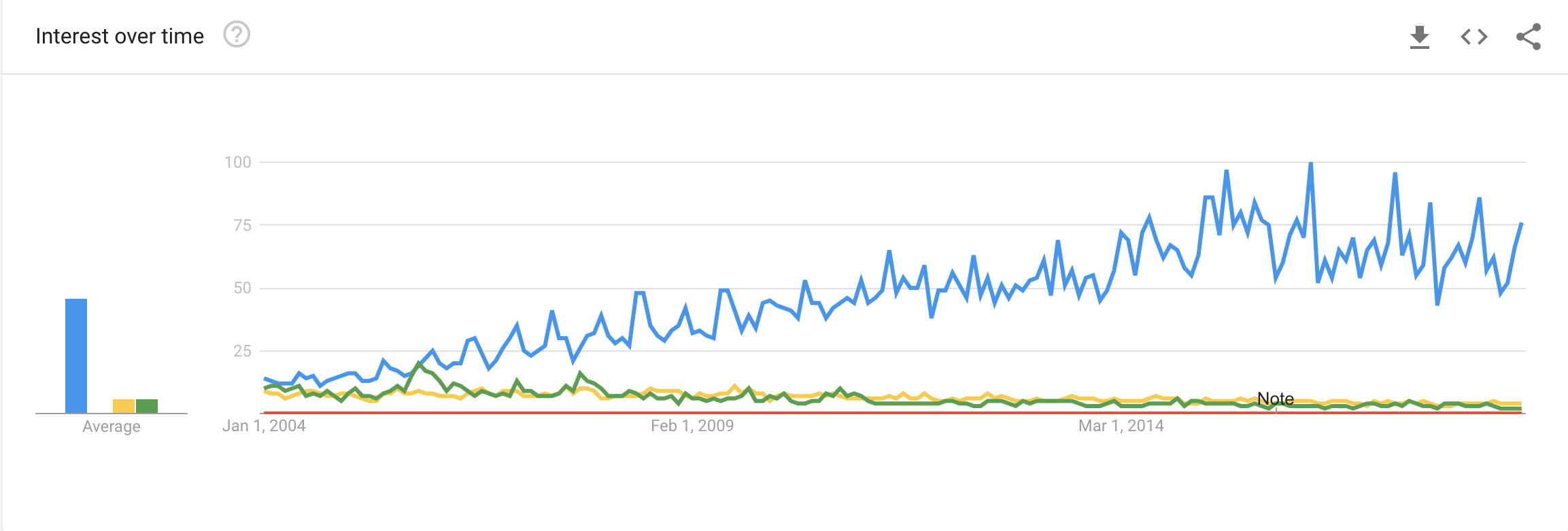
The data that we are working with this semester is Google Trends data which is time series data. It seems to me that there is huge interest in creating more appropriate ways to represent this data in an informative and visually appealing way.

Naturally, I wanted to get in on the hype. I decided to play around with the gganimate library to visualize the spike in searches for Picasso after one of his paintings auctioned for an astonishing price. There was another peak where there was a documentary released about his life. This is two dimensional data so the most appropriate way to represent this data according to what we learned about visual hierarchy is to encode by position or length. However, I wanted to generate an animation with the size of points as the search interest and the time being represented as time in an animation. Huge shout out to the community of developers that make these R packages for users like me (https://www.google.com/search?q=intall+gganimate&oq=intall+gganimate&aqs=chrome..69i57j0l5.3769j1j4&sourceid=chrome&ie=UTF-8)
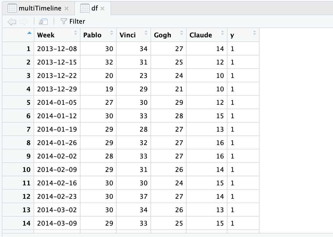
gganimate is still in development so there were lots of kinks to iron out. but I represented my search data in a format that ggplot can interpret.

Here is the block of code that I used to generate the visualization.
# install.packages('devtools')
install.packages("ggplot2")
devtools::install_github('thomasp85/gganimate')
install.packages("gifski")
install.packages("knitr")

# Generates the
plot <- ggplot(df, aes(y,y,size = Pablo)) + geom_point() + transition_time(Week) + ease_aes('linear')
animate(plot, renderer = gifski_renderer(file = tempfile(fileext = ".gif"), loop = TRUE, width = NULL, height = NULL))
anim_save(file = "~/plot.gif")
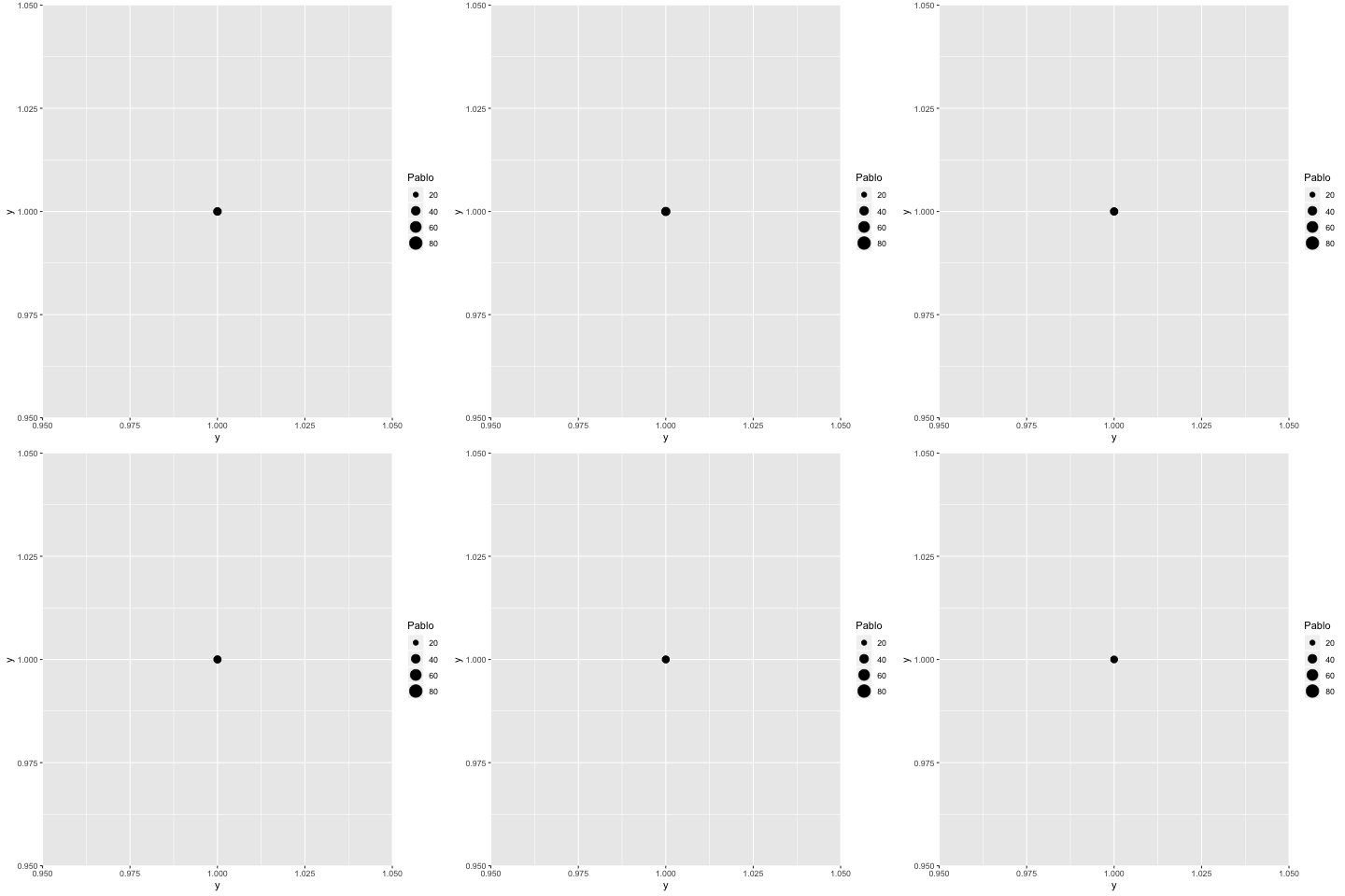
Here was the output!

I don’t think that this is, as is, is appropriate to visualize the peaks in search interest but with some user interactivity, there might be a way to add some life into time-series data. Another design decision that would be wise is to indicate the peaks with a silhouette overlay of the circle when it is at its maximum size - this will allow the user to compare the current value in the time-series to a significant event indicated by the silhouette and an annotation layer.