Chartjunk
The title of this Tufte chapter is apt in that there are many graphs in science that are actually junk. I expected Tufte to start criticizing every graphic that was to have ever existed; however, Tufte points out elements that one should not use when designing a graphic. Most of his ‘rules’ apply to charts in print in a black-white medium. I am doubtful that these axioms will hold true as we move away from print graphs.
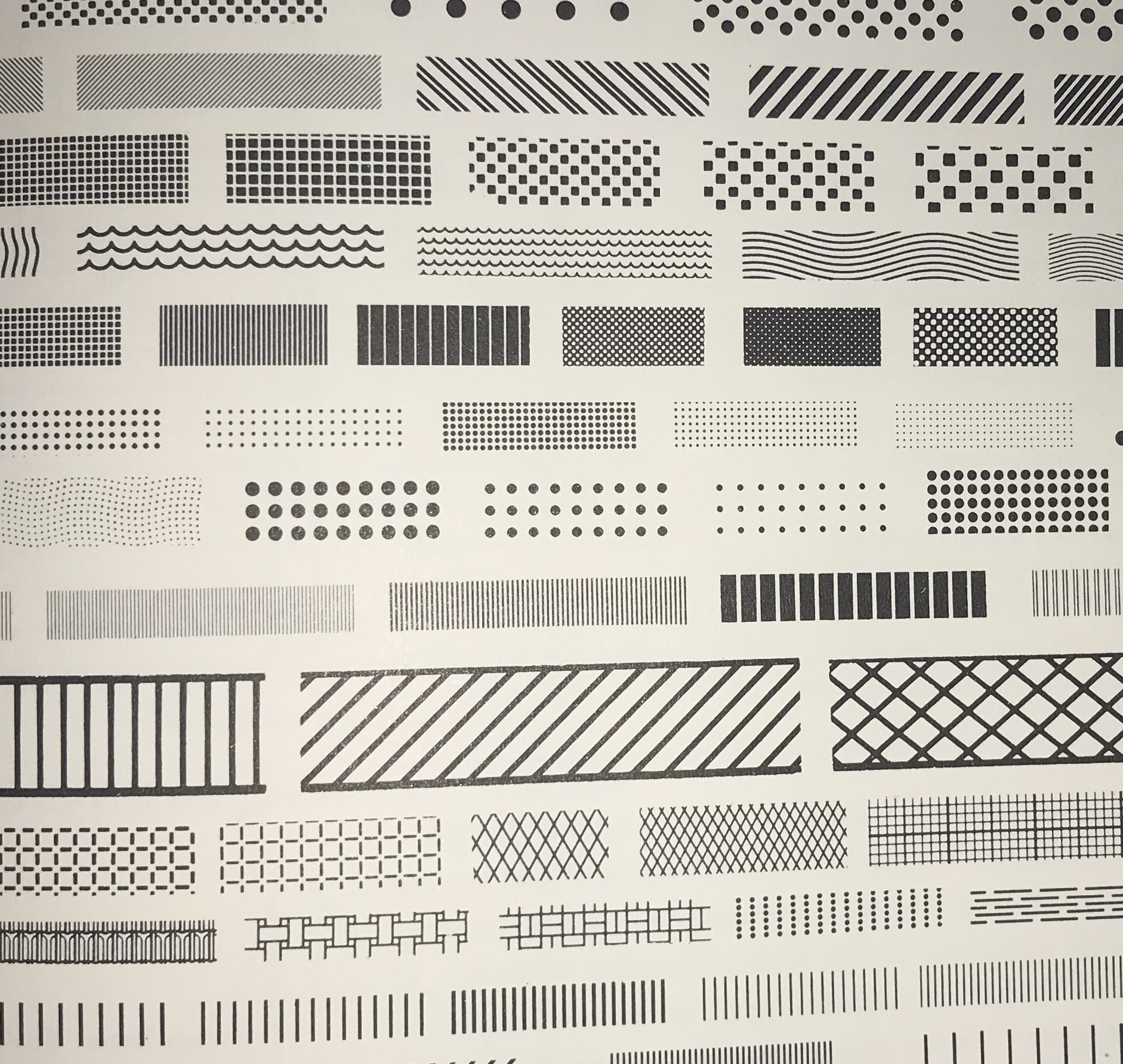
- Do not use textures to denote categories

Tufte gives examples of how textures to denote categories can look messy. I have always seen the option in illustrator to add ‘texture’ to an object but since most of my work is designed to be viewed on twitter/computer, I always use color. Tufte gives examples of textures that can be visually jarring. These patterns confuse the reader and detract form the message of the graphic.
Later on in the chapter, Tufte lists scientific journals where people use these vibration-like textures the most. I definitely have seen many of the graphs with patterns mainly in the older papers.
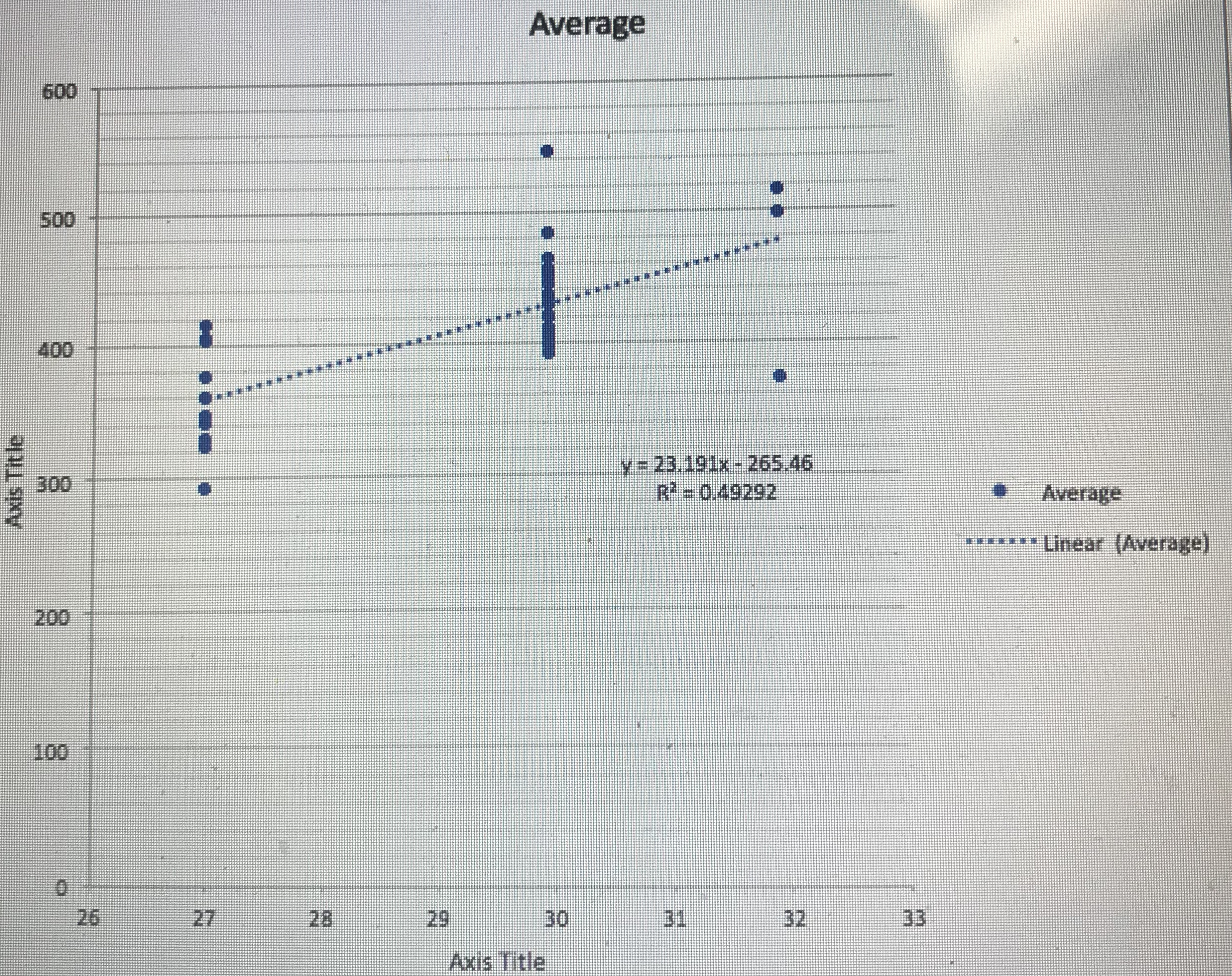
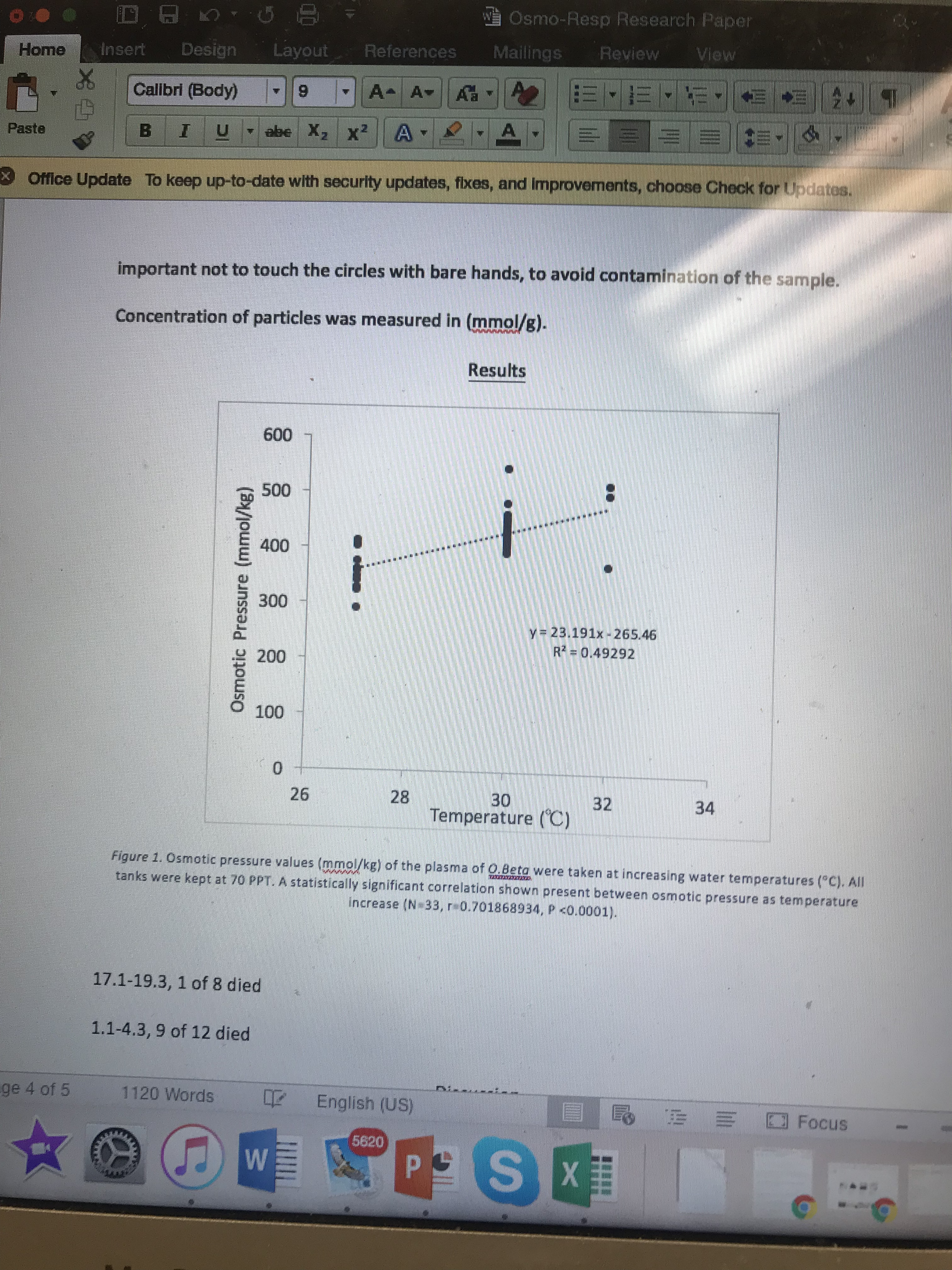
- Do not use grids on graphics.


This goes back to Tufte’s theories on data-ink ratio. He states that you should keep the background grid minimal and I really agree. The other day when I was helping my Miami-Dade College students generate graphs for their scientific poster, I had the opportunity to put this rule into action!
- Ducks are not good.
Someone in my Data Visualization class is actually doing a project on migratory patterns of ducks, so I found this section a little funny. Interestingly, upon some googling I found out that waterfowl biologists makes alot of money mainly from donations from duck-hunters. Ducks are graphs that simply lack substance but are visually appealing. I do have to admit that I had a good laugh at Tufte’s commentary on this matter.