R-Basics
This week, we were supposed to get some basic understanding of how R works. I actually ended up learning the basics of R by doing a biology project when I was an sophomore in undergrad. That project was aimed at understanding how groups of genes move up and down together in response to the host plant engaging in mutualism ( you can view it here unless its behind a paywall https://onlinelibrary.wiley.com/doi/abs/10.1111/mec.14550). While this project could have theoretically been implemented in Python, C, or any programming language, R has a rich body of scientific packages. We used existing packages which were already published which can help with reproducibility. Since I already knew the basic syntax, I ended up downloading a dataset from the Miami-Dade School District that gives the proportion of students on Free or Reduced Lunch per school. I always had to fill out those forms at then beginning of the year when I was going through grade school, and now I appreciate the utility of those surveys! The first step is to download the data into a known path. Luckly, the data was already in a tab-deliminated format. I find that a good text editor goes a long way. I use TextWrangler since I recently moved over into the Apple ecosystem, but if you are still in windows, Notepad++ is awesome. While R-Studio has a place where you can edit the text and run the commands, I love the coloring that these text editors give to different data types and variable. After downloading, you can assign the data farme to an informatively named variable.
percentage_of_free_reduced <- read.table("~/Downloads/Data/percentage_of_free_reduced.txt", quote="\"", comment.char="")
I am trying to learn ggplot2, so I am going to use this package to explore my data. To install ggplot2, execute the following
install.packages(ggplot2)
library(ggplot2)
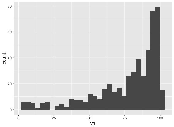
Then to plot the data, make the well-named variable equal to the data parameter of the ggplot2 function. I want to investigate the frequency so the geom_histogram will let me do that.
ggplot(data = percentage_of_free_reduced) + geom_histogram(aes(x= V1))
Voila!

Now I have a bunch of questions as to the geographical distribution of these schools. During the summers, kids that get free and reduced lunch can be food insecure. Maybe for next week, I will plot these schools on a map of the county and generate a choropleth map based on the percentage of kids with free and reduced lunch. Then, I can look at where free and reduced lunches are offered during the summer and see if there is any area that needs more sites service free lunch during the summer.